Memories are what make a place a place | Ada Karmi-Melamede
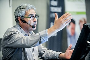
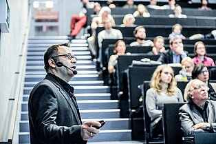
The first November Talk in Prague drew to a close with a presentation by the prominent Israeli architect Ada Karmi-Melamede. To begin with, Karmi-Melamede spoke about the history of the different styles of 20th-century modern architecture and her own experiences of these styles, before going on to discuss the somewhat chaotic nature of current architectural practice.
The 20th century saw a major change in architectural design, with the loss of the identity and hierarchy of the individual elements, and therefore of the social order. Technical progress enabled ground plans and facades to be designed freely and meant that they were no longer dependent on structural and supply requirements. This was accompanied by a fragmentation and destruction of order systems and a new obsession with the packaging and surface of the buildings.
Ada Karmi-Melamede used a number of images to illustrate the basic theses of her work, in which she identifies two different faces of buildings or – to put it another way – of environments in general: the public and the private face. The two faces have different aims and use different means to achieve them.
Taking the example of a detached house, Karmi-Melamede demonstrated how the facade on the street side has a fixed and ordered design, whereas the design of the garden-side facade is much more free. The entrance area, which has a classic design, also meets two different conditions – as well as a large entrance for visitors, it also has a small door for private use.
For Karmi-Melamede, light and space are extremely important. She sees space as a unique material, a basic unit for her work, which she can reshape and modify however she wishes. In her opinion, the task of architecture is not to occupy and take up space, but to turn the space into a place. After all, a place only becomes a place when people associate it with memories.
As Ada Karmi-Melamede says, she comes from a place where the stone is soft and therefore porous and vulnerable; where bricks are produced locally and are therefore cheap; where shade, water, and greenness are rare but light is available in excess. That’s why she sees light as the best, and cheapest, building material.
Referring to a project that has not been realised, a synagogue designed by Louis Kahn, she disscussed it as a good example of a two-layered design. A type of building within a building, which forms its own rooms.
In the main part of her presentation, Ada Karmi-Melamede spoke about her work on the Supreme Court in Jerusalem, one of her most significant buildings. The building combines a number of the city's important facilities. The distinctive north/south axis connects the city's bus station to the seat of parliament, and represents a significant element in the building composition. The east/west axis, meanwhile, connects park areas with the Givat Ram university campus. This basic geometry divides the building into four parts with four different functions: library, court room, judges’ chambers, and park area.
The library is an atypical building with a pyramid in the interior. The pyramid is surrounded by natural light, illuminating the entrance level which serves primarily as the foyer and is open to the public. The upper levels of the library are used by the judges. From the main entrance level in front of the courtrooms, you can see the convergence of two forms and materials. The stone wall with its small openings symbolises stability and a down-to-earth quality, while the rounded, plastered edges soar up to the sky. The two forms do not touch each other, creating light effects between the different substances and providing natural lighting from above.
Ada Karmi-Melamede also used another of her significant projects, the Open University – Ra’anana campus, to illustrate her design principles. Inside the building complex is a public square, which is surrounded by all of the public function rooms and communal rooms for students, including a library and a lecture hall underneath the square. Karmi-Melamede’s work with different terrain heights is characterised by sensitivity. Karmi-Melamede compared a viewing angle from below with the experience of looking at trees – because it is only when we look at them from below that they appear grand and majestic. The public and private functions are distinguished through the use of different materials – stone for the private part of the campus and concrete for the public part.
Part of the building complex houses a synagogue with a glazed facade in the entrance area, on the north side of the building. The building has an atypical ground plan which takes the form of a quadrant. A central interior element consisting of wooden slats uses light to emphasise the unique work. The School of Government and Policy is connected to the School of Business, creating a shared building which is used by the students as a meeting point and which symbolises the figurative convergence of political and business affairs.
Part of the building is set below ground, creating a level which is used as a courtyard. At this point, Karmi-Melamede presented a design for a glazed facade: rather than being an open space, the area behind the facade features elements such as stairs and bridges. A load-bearing wall which is thick enough for all media forms the interior of the university using a window grid pattern.
The final project in the presentation, the “Ramat Hanadiv” visitor centre, provides a suitable space for exhibitions and educational events. It is surrounded by numerous gardens of the same name which have been created in the form of earthworks and are separated by hedges. There is a park next to the building. The buildings are built underground – their roofs slope sharply and are completely covered with plants. They stand opposite each other. Separated by light, they are highly symbolic and form a passage which is used by the public. A passage which symbolises both light and shade.
Ada Karmi-Melamede’s presentation was an inspirational demonstration of contemporary architecture and its stylistic directions. It put forward two central questions: how should we use the new? And what should we retain of the old?


